
Simple Conversion Tweaks That Make a Big Difference
Most businesses think they need more traffic. In reality, they need more conversions from the traffic they already have.
You don’t need a redesign.
You don’t need a rebrand.
You don’t need to spend more on ads.
You just need to remove the friction that stops people from getting in touch.
I’ve lost count of how many websites I’ve reviewed over the years that look good but quietly kill enquiries with tiny problems. The fix isn’t complicated. You don’t need a conversion agency or a pile of analytics reports. You just need to fix a handful of simple things that guide people to action instead of letting them drift away.
This article isn’t theory. Everything here is something you can do today — no coding, no new software, no drama. Just practical conversion improvements that help your website win more business.
If your website gets visitors but very few enquiries, this guide will show you why — and what to do about it.
Let’s get into it.
The Fast Wins Conversion Philosophy
Before we dive into specific fixes, there’s one mindset shift that instantly improves your website:
Stop trying to impress people. Start helping them make a decision.
Visitors don’t come to your site to admire your brand or read paragraphs of corporate waffle. They come with a question in their head:
“Can you help me, and why should I choose you?”
If your website answers that quickly, you’ll get enquiries. If it doesn’t, they’ll leave and find someone who does. Conversion is really that simple.
And here’s the good news: improving conversions rarely requires new pages, fancy design or expensive copywriters. Most of the time, you just need to remove confusion and build trust.
Let’s jump into the practical stuff. These fixes are simple, fast and proven. Do even half of these and your enquiry rate will increase.
Conversion Win #1: Fix Your Headline So People Instantly Understand What You Do
This is the biggest conversion killer on most websites: the headline doesn’t make sense.
It’s either vague:
“Delivering excellence since 2012”
Or abstract:
“Innovating the future of digital experiences”
Or just nothing:
“Welcome to our website”
A homepage headline has one job — to tell people what you do and who you do it for. That’s it. No poetry. No corporate slogans. No clever word games. Just clarity. Clarity builds confidence, and confidence drives action.
If your headline doesn’t pass the 5-second test, you’re losing enquiries. A stranger should land on your site, read your headline, and instantly know if they’re in the right place.
Bad headline examples:
- “Professional Services for Modern Businesses”
- “Digital Solutions That Drive Growth”
- “Experts You Can Trust”
Could be any business. Means nothing.
Good headline examples:
- WordPress websites that bring in leads for small businesses
- Accounting for UK trades and construction businesses
- Loft conversions in Surrey for families who need more space
- SEO for service businesses who want steady, reliable enquiries
Quick Fix:
Use this simple template:
[What you do] for [who you do it for] so they can [benefit].
Examples:
- Website design for small businesses who want more enquiries
- SEO for service businesses who want to get found online
- Kitchen installations for homeowners who want modern, practical spaces
If you do nothing else after reading this article, fix your headline. It is the biggest small win you will ever make.
Conversion Win #2: Add a Subheadline That Makes People Care
Once you’ve grabbed attention with a clear headline, the next line should build relevance. This is where most websites miss an easy win. They nail the headline, then go straight into a generic paragraph that feels like brochure talk.
What you need here is a simple follow-up line that explains why your service matters — in human language.
Think of your subheadline as a reassurance line. It tells your visitor:
- Yes, you’re in the right place
- Yes, I understand the problem you’re trying to solve
- Yes, this could actually help you
Weak subheadline examples:
- “We are committed to delivering quality and value.”
- “We offer a range of services to meet your needs.”
- “Professional and reliable every step of the way.”
These say nothing. They could come from a random template.
Strong subheadline examples:
- Most websites look good but don’t generate real enquiries. I build sites that quietly win business.
- No jargon, no overcomplication — just straight, useful SEO that gets you found by the right people.
- If you want a builder who actually turns up, gives straight answers and does things properly, you’re in the right place.
Quick Fix:
Use one of these subheadline templates:
- I help [audience] who are frustrated with [problem], so they can [result].
- If you want [outcome] without [pain point], I can help.
- [Service] done properly — no [industry nonsense].
Copy-and-paste examples:
- I help small business owners who are tired of websites that look good but don’t generate enquiries.
- Straightforward SEO without the jargon, hype or guesswork.
- New driveways installed properly — no hassle, no shortcuts, no surprise costs.
This one line keeps people on your page. It bridges curiosity into interest — and that’s conversion gold.
Conversion Win #3: Put a Clear Call to Action at the Top (Don’t Make People Hunt for It)
Most websites bury their call to action. It’s either hidden in the footer, buried below a wall of text, or hiding behind vague button text like “Learn more” or “Submit”.
Here’s the truth: if someone has to scroll to figure out how to contact you, you’ve already lost them.
A clear call to action (CTA) must sit in your hero section, right under your headline and subheadline. It should be obvious, friendly and specific. Don’t be shy about it — people actually appreciate clarity.
Bad CTA examples:
- Learn more
- Submit
- Click here
- Contact
- Get started (with no context)
These don’t guide decisions. They’re empty actions.
Strong CTA examples:
- Book a free website review
- Get a quote
- Request a call
- Check availability
- See pricing
These reduce friction and move people forward.
Quick Fix:
Use one main CTA at the top. Don’t give visitors too many choices. One button. One decision. One next step.
Example layout:
Headline
Subheadline
[Book a free consultation]
That’s it. Clean and confident.
Bonus: Use a Support CTA
Some people aren’t ready to talk yet. Give them a softer path. This is like a friendly side door. For example:
Primary CTA: Book a call
Secondary CTA: Watch how it works
Or:
Primary CTA: Get a quote
Secondary CTA: View recent projects
It keeps more people engaged instead of bouncing.
Conversion Win #4: Cut the Paragraph Waffle (Make Your Message Scannable)
Most websites lose enquiries because visitors get bored before they understand the offer. Not because the offer is bad — but because the copy is heavy and slow.
Online, people don’t read at first. They scan. Big chunks of text kill momentum. Long paragraphs feel like effort. When something feels like effort, people leave.
The 3-Second Rule
If I can’t scan your page and understand the main points in three seconds, it’s too dense.
Bad Example:
We are a family-run construction company with over 25 years of experience delivering high-quality building services for domestic and commercial clients. We pride ourselves on our professionalism, excellent customer service, and attention to detail across every project we undertake.
It’s not awful. But it’s a slog to read.
Better Version:
Building work done properly for over 25 years.
- Extensions, refurbishments and structural work
- Clear timelines and honest pricing
- Respectful team who turn up and get it done
- No drama, no hidden extras
Short. Scannable. Confident. That gets read.
Quick Fix Checklist:
- Break big paragraphs into shorter chunks
- Use bullet points to highlight value
- Write in plain English
- Delete filler words like “innovative”, “solutions”, “deliver”, “leverage”
- Front-load value — don’t warm up, get to the point
Your job isn’t to write more. Your job is to help people understand faster. That’s what converts.
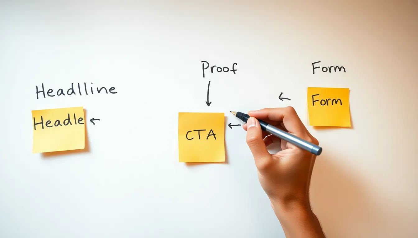
Conversion Win #5: Add Proof Early — Don’t Make People Trust You Blind
One of the biggest conversion killers is lack of proof. Most websites make bold claims without showing a single shred of evidence. That might have worked in 2008. Today, people are more sceptical than ever.
If you want enquiries, you must build trust quickly. Don’t wait until the bottom of the page to prove you’re good — show it near the top.
What counts as proof?
Proof is anything that reduces doubt:
- Testimonials with names and details
- Before/after results
- Case studies
- Google reviews
- Years of experience
- Industry specialisation
- Recent projects
- Screenshots
- Logos of clients or accreditations
Bad example:
We pride ourselves on excellent service.
Says who?
Better example:
“Neil rebuilt our old website properly. Enquiries started in the first week and we’ve been getting steady leads ever since. Clear, honest advice — no faff.” — Claire Hudson, Design Agency Owner
Much better.
Quick Fix:
Add one piece of proof to the hero area of your homepage or service page.
Example layout:
Headline
Subheadline
Call to action
Trusted by over 120 small businesses across Surrey and Hampshire
★★★★★ Rated 5.0 on Google Reviews
This instantly changes how seriously people take you. Proof reassures people that getting in touch won’t be a risk.
Bonus: Use “Proof Anchors”
These are small lines that position you with quiet confidence. Examples:
- Over 30 years building websites that win business
- Most projects delivered in 2–4 weeks
- 90% of work comes from recommendations
Proof isn’t bragging. Proof is reassuring. Add it early.
Conversion Win #6: Make Your Service Pages Clear (Not Clever)
A big reason websites don’t convert is because service pages are written like brochures, not conversations. They describe what the business does, but not why someone should care or why they should choose you.
Most service pages:
- Start with vague intros nobody reads
- List features without meaning
- Avoid mentioning price
- Don’t explain how to get started
- Have no structure and no flow
A strong service page removes questions and reduces hesitation.
The Simple Service Page Structure
Use this layout on every service page:
- Clear headline
Web Design for Small Businesses - Short relevance intro
If your website looks okay but isn’t bringing you enquiries, I can help. - Benefits over features
- Built to win enquiries
- Lightning fast load times
- Easy to update yourself
- How it works
Step 1 call → Step 2 plan → Step 3 build → Step 4 launch - Proof
Short testimonial or result - Pricing guidance
Projects from £1,200 - Call to action
Request a quote or Book a call
Why this works:
- It answers questions before people ask them
- It builds trust without bragging
- It feels easy to say yes to
Quick Fix:
Open your service page. Does someone understand your offer in 10 seconds? If not, fix your headline and intro first. Then build the structure above.
Conversion Win #7: Use a Real “How It Works” Section to Remove Fear
People don’t fill out contact forms because they’re nervous about what happens next.
Are you going to pressure them?
Is there a contract?
Will you bombard them with sales emails?
Is this going to waste their time?
A simple How It Works section removes that fear and increases enquiries overnight.
Bad Example:
Contact us and we will be happy to help.
That invites uncertainty.
Strong Example:
How it works:
- Quick call — understand what you need
- Plan — we agree the best approach
- Build — I deliver the work
- Review — you approve everything
- Support — optional help ongoing
This makes your process feel simple and safe. That builds trust. Trust increases action. It’s a straight line.
Quick Fix:
Add a 3–5 step “How it Works” section on every service page and just above your main call to action at the bottom of longer pages. Keep each step to one short sentence so it’s easy to skim.
One more tip:
Use short step titles like these:
- Discovery Call
- Plan Together
- Build & Deliver
- Review & Launch
- Support if Needed
This feels like a journey. Humans follow journeys.
Conversion Win #8: Stop Hiding Your Prices
This is a big one. Most websites lose enquiries because they avoid talking about price. When people can’t find any pricing info at all, they assume one thing:
“It’s going to be expensive.”
Or worse:
“I’ll get trapped in a sales call.”
You don’t have to publish your entire price list or lock yourself into quotes, but you must give people a sense of cost so they feel safe enough to start a conversation.
Why pricing matters for conversion:
- It builds trust
- It filters out time-wasters
- It attracts serious buyers
- It stops people from guessing and leaving
Options for showing price safely:
Pick one that fits your business.
| Pricing Style | Example |
| From Pricing | Websites from £1,200 |
| Price Range | Typical projects £1,200–£3,500 |
| Packages | Starter, Growth and Pro options |
| Custom Pricing + Guidance | Every project is different, but I’ll give you a fixed quote before we begin |
| Price with explanation | I’m not always the cheapest, but I do things properly and there are no hidden extras |
Conversion Win #9: Remove Form Friction (Make It Easy to Contact You)
Your enquiry form could be quietly killing leads. Most are built for the business, not the visitor. They ask for too much, feel cold, and don’t explain what happens next. People don’t fear filling out a form — they fear what happens after.
The 3 big problems with most forms
- Too many fields – asking for full address, budget, life story
- Zero reassurance – people don’t know what happens after they click
- High-commitment wording – “Submit” feels like signing your soul away
Quick Fix Formula
Make your form:
Short + Friendly + Reassuring
Do this:
- Max fields: Name, Email, Message (phone optional)
- Replace “Submit” with something human: Send Message or Request a Call
- Add a reassurance line under the button:
- I’ll reply within 24 hours
- No sales pressure — just a quick chat
- Your details are never shared
Example:
Send a message
I’ll reply within one working day. No pressure, no pushy follow-up.
That feels safe. Safe pages convert.
Bonus Conversion Tip
Add a contact alternative:
Some people hate forms. Add a line that says:
Prefer email? neil@yourdomain.co.uk

Conversion Win #10: Remove Dead Ends (Guide People to a Next Step)
A huge conversion killer most people never notice: dead ends on your website.
A dead end is any page that doesn’t guide people to do something next. No call to action. No button. No reason to continue. Just a quiet full stop. And when your page stops, your visitors stop — and leave.
Pages that often die:
- About pages with no next step
- Service pages with nothing after the last paragraph
- Blog posts that teach but never guide action
- Case studies that end with “Thanks for reading”
- Homepage sections that say a lot but go nowhere
Dead ends destroy conversions because people need direction. If you don’t guide them, they drift away.
Quick Fix:
Every single page on your site must have a CTA.
Doesn’t have to be aggressive, doesn’t have to be salesy — but it needs purpose.
Examples:
- Ready to get started? Book a call here
- Tell me what you need and I’ll send a quick quote
- Want me to take a look at your site? Request a review
Smart move:
Use a Footer CTA strip so every page has a consistent next step.
Example:
Let’s improve your website without the faff.
[Request a call] [View pricing]
Add that, and you turn every page into a conversion opportunity.
Conversion Win #11: Stop Hiding Important Information (Be Transparent)
A lot of websites unintentionally scare people away because they hide key information. Visitors shouldn’t have to work to understand your business. When answers are missing, people assume the worst.
Things people want to know before they contact you:
- What do you actually do?
- Who is this for?
- Where are you based?
- Do you work locally or nationwide?
- How much does it cost?
- How long does it take?
- Is there a contract?
- What happens next?
If your website doesn’t answer these basics, people won’t enquire — they’ll hesitate and leave.
Quick Fix:
Add an Info Panel section to your homepage or service pages that gives people the essentials fast.
Example:
Project Timeframe
Most projects completed in 2–4 weeks
Location
Based near Guildford, working across Surrey and Hampshire
Who I Work With
Small businesses, trades, and service companies
Pricing
Websites from £1,200
That tiny block builds trust without writing an essay. It removes doubt. When doubt goes down, conversions go up.
Bonus:
If you offer guarantees or reduce risk, say it clearly.
- Fixed quotes, no hidden extras
- You own your website, always
- Honest advice, even if we don’t work together
Make choosing you feel safe.
Conversion Win #12: Make Your Copy Sound Like a Human, Not a Brochure
People don’t connect with websites that sound robotic, corporate or AI-generated. They connect with people. If your website sounds like it was written by a committee, it won’t convert — even if everything else is good.
The problem:
Weak copy sounds like this:
We pride ourselves on delivering professional services with exceptional customer care and bespoke solutions tailored to your needs.
That doesn’t build trust because it isn’t real. It doesn’t feel like it was written by a human being who understands a problem or can solve it.
Strong copy sounds like this:
I build clean, fast, lead-focused WordPress websites for businesses who want more enquiries — not more headaches.
Short. Clear. Direct. Human.
Simple way to humanise your copy:
Use the Coffee Test. If your sentence would sound weird if you said it out loud over a coffee with someone, don’t write it.
Quick rewrites you can steal:
| Brochure-speak | Human version |
| We deliver tailored digital solutions | I build websites that do what you actually need |
| We provide high-quality service | I do the job properly without the drama |
| Get in touch for a bespoke quote | Tell me what you need and I’ll send a quick price |
Conversion Win #13: Add Trust Anchors in the Right Places
Most businesses think trust comes from having a Testimonials page. It doesn’t. Nobody visits a Testimonials page and thinks, “Well now I’m convinced.”
Trust needs to be built throughout the journey, not stacked in one boring page nobody reads.
What’s a trust anchor?
A trust anchor is a small piece of proof that reassures someone at a crucial moment. These belong throughout your pages — not hidden away.
Where trust anchors should go:
Place them where people hesitate:
| Location | Trust Anchor |
| Under headline | “Rated 5.0 on Google Reviews” |
| Near pricing | “Fixed quotes, no surprise costs” |
| Near enquiry form | “I’ll reply within 24 hours — no sales pressure” |
| Next to CTA | Short testimonial |
| Below service intro | “Over 180 websites delivered” |
| In footer | Accreditation logos or review badge |
Conversion Win #14: Fix Your About Page (Make It About Them, Not You)
Your About page is one of the most visited pages on your site, yet most businesses completely waste it.
They fill it with history.
They write paragraphs nobody reads.
They make it sound like a CV.
They talk about “mission statements” and “values”.
The truth:
People don’t visit your About page to learn your life story.
They visit it to find out if you are a real, trustworthy person or business.
What people really want from your About page:
- Who are you really?
- Do you actually know what you’re doing?
- Do you work with people like me?
- Can I trust you?
- Why should I choose you?
Quick About Page Structure:
Use this instead of your current waffle:
- Plain-English intro
Who you are + who you help + why. - What makes you different
Your approach, your values in action. - Proof you’re credible
Experience, results, reviews. - What working with you is like
Reassurance + expectations. - Call to action
Invite the next step.
Example rewrite:
Weak:
We were founded in 2012 and pride ourselves on customer service and professionalism.
Better:
I’m Neil. I build websites that don’t just look good — they generate enquiries. I work with small businesses who want results without the agency nonsense. Straight advice, honest pricing, solid work.
See the difference? One sounds like a brochure. The other sounds like a human.
Conversion Win #15: Stop Making People Scroll Forever
Endless scrolling kills conversions. When your homepage or service page goes on forever with no structure, people simply give up.
Visitors are not against scrolling. They’re against scrolling with no purpose.
Fix it with sectioning:
Break your pages into clear sections with helpful headings:
- Who this is for
- Why it works
- What you get
- Proof
- Pricing
- How to start
This creates rhythm. Rhythm keeps people moving. Movement leads to action.
Quick Fix:
Go through your homepage and:
- Split long sections into smaller blocks
- Add helpful headings
- Remove filler paragraphs
- Use spacing to make scanning easy
If your page flows, people convert. If it drags, they leave.
Conversion Win #16: Use Visual Direction to Guide the Eye
Even if your copy is strong, bad layout can kill conversion. The human eye needs direction. If everything on the page has the same weight (same font size, same layout, no emphasis), people don’t know what to look at — so they look at nothing.
Good conversion layout guides visitors through the page naturally.
The Z-Pattern
This is how people scan most websites:
Top left → across → diagonally down → across.
That means:
- Your headline and CTA belong at the top
- Proof belongs early
- Navigation must stay simple
- Final CTA belongs bottom right
Visual hierarchy tips:
- Use larger bold headlines for key sections
- Make your CTA button visually obvious (but not aggressive)
- Keep spacing consistent
- Avoid clutter
Quick Fix:
Do this 10-second test:
Squint your eyes at your homepage. Can you still see what matters?
Your CTA should still stand out.
Your message should still be clear.
Your page should still feel calm.
If it doesn’t, simplify layout and spacing until it does.
Conversion Win #17: Stop Using Weak Button Text
“Learn more”
“Submit”
“Send”
“More info”
These buttons are dead weight. They don’t move people. They don’t remove hesitation. They certainly don’t drive enquiries.
Button text shouldn’t describe the action. It should reinforce the decision.
Strong button examples:
- Make an enquiry
- Book a discovery call
- See how it works
- Request pricing
- Get a website review
- Check availability
Even better, add micro reassurance under the button:
- Takes less than 30 seconds
- No sales pitch
- Free and helpful
Quick Fix:
Update all button text to decision-focused language.
You’ll be shocked at how much of a conversion lift this creates on its own.
Conversion Win #18: Add “What You Get” Lists (Make Value Obvious)
A lot of websites talk about what they do, but they don’t explain what the customer actually gets. Visitors shouldn’t have to guess what’s included when they work with you. Lack of clarity increases hesitation, and hesitation kills conversions.
The easiest fix? Add a “What You Get” section.
Example – Web Design
What you get:
- A fast, lead-focused WordPress website
- Built properly and easy to update
- Mobile optimised
- SEO-ready structure
- Clear calls to action
- One-to-one support
- No agency nonsense
Example – Accountant
What you get:
- Monthly bookkeeping done properly
- VAT returns handled for you
- Simple reports you can actually understand
- Year-end accounts filed on time
- Unlimited support by phone or email
Example – Builder
What you get:
- Fixed quote before work begins
- Clear schedule and timelines
- Professional, respectful build team
- Regular updates so you know what’s happening
- No hidden extras
Quick Fix:
Make this a standard section on your service pages. It removes uncertainty and makes your offer feel concrete and valuable.
Conversion Win #19: Add a Soft CTA Before the Hard CTA
Not everyone is ready to contact you. Some people need a lighter next step — a small interaction before committing.
If your only CTA is “Book a call” or “Request a quote”, you’re losing people who aren’t ready yet but might convert later.
Soft CTA ideas:
- Download a checklist
- View recent projects
- See pricing
- Read FAQs
- Watch a demo
- View case studies
- Follow on LinkedIn
Example layout:
[Primary CTA – Book a call]
Not ready to chat yet?
[See how I work]
[View pricing]
[Read FAQs]
This keeps people engaged on your website instead of leaving. And that increases enquiries over time.

Conversion Win #20: Replace Stock Language With Real Words
Weak websites use empty phrases that sound safe but say nothing. Visitors see these and instantly switch off because they’ve read the same lines on a thousand other websites.
Phrases that kill trust:
- “We go above and beyond”
- “Quality service you can trust”
- “Customer satisfaction is our priority”
- “Committed to excellence”
- “Tailored solutions”
- “Innovative strategies”
These phrases are invisible. People skip past them.
What to do instead:
Use specific language that shows what you actually mean.
| Bad | Better |
| We provide high-quality websites | I build websites that load fast, look good and generate enquiries |
| Customer satisfaction is our focus | I do the job properly and I’m easy to work with |
| Tailored service | No templates — everything is built around your business |
Conversion Win #23: Stop Using Walls of Text – Use Section Headers
Conversion isn’t just about words — it’s about structure. If your page feels heavy, people won’t read it. If people don’t read it, they won’t take action. It’s that simple.
Section headers make your content skimmable. They pull people through the page and keep them moving without effort.
Bad example (what most websites do):
A giant paragraph explaining everything in one go about who they are, what they do, what makes them different, their process and why you should pick them — all thrown together in a single boring block.
Better example:
Use clear headers like:
- Who this is for
- Why this works
- What you get
- How it’s different
- What happens next
- Pricing
- FAQs
Each header resets attention and keeps the visitor engaged.
Quick Fix:
Scan your homepage and service pages. If you have more than 6 lines of text without a section header, add one. Break things up.
Conversion Win #24: Speak to Your Ideal Customer (And No One Else)
Trying to appeal to everyone is a conversion killer. When you try to sound “professional and suitable for all”, you end up sounding generic and forgettable. Strong websites are specific.
Weak:
“We offer website design for businesses of all sizes in every industry.”
Bland. Unfocused. Feels like no one.
Strong:
“I build websites for small service businesses that want steady enquiries — not overcomplicated marketing.”
Much better. A real person reads that and thinks, “That’s me.”
Quick Fix:
Finish this sentence:
I work best with…
Examples:
- I work best with small UK businesses who want results, not noise.
- I work best with honest trades and service businesses who want a proper online presence.
- I work best with business owners who value clarity and straight advice.
You don’t need to exclude people — just show who you’re best for.
Conversion Win #25: Pre-qualify Leads With a Helpful CTA
Not all enquiries are equal. Some people are serious. Some people are browsing. Some people are time-wasters. Most websites convert worse because they let everyone through the same door.
Here’s how to quietly improve lead quality while also increasing conversions:
Use a pre-qualifying call to action.
Examples:
Instead of:
“Get a quote”
Use:
“Tell me what you need and I’ll send a quick price — no sales pitch.”
Instead of:
“Book a call”
Use:
“Book a free 15-minute chat — we’ll see if we’re a good fit first.”
This sets healthy expectations and reduces pressure for both sides. The right people lean in. The wrong people drift away. Perfect.

Advanced Conversion Wins (For Even Bigger Impact)
These aren’t essential, but if you want to push conversions higher, these are powerful extras.
Use directional copy
Instead of vague CTAs like “Contact us”, use helpful microcopy above buttons:
- Not sure where to start? Let’s talk.
- Got questions? Ask me anything.
- Want an honest second opinion?
These feel conversational, not corporate.
Build conversion momentum
Place small CTAs earlier in the page:
- View recent projects
- See how it works
- Read FAQs
Small steps build trust and momentum toward bigger actions like calls or quotes.
Give people language to use
People often want help — they just don’t know how to ask. Add a message helper under your form:
“Tell me a bit about your project. For example: ‘We need a new website that brings in leads. We’re a small team and don’t want agency nonsense.’”
That removes friction and increases enquiries immediately.
Conversion Checklist (Print This and Fix Your Website)
Tick these off and your conversions will improve — guaranteed.
- Headline clearly says what you do
- Subheadline explains why it matters
- CTA visible at top and bottom of page
- Benefits shown before features
- Proof added early and often
- How It Works section included
- Prices or pricing guidance shown
- Human-friendly copy
- No dead ends — every page has a next step
- Value made obvious with What You Get list
- Trust anchors added in key areas
- Soft and hard CTAs both included
- Forms are short and friendly
- Layout is simple and easy to scan
- Button text drives decisions
- Page speaks to a specific audience
If you fix those, your website will convert better than 90% of small business sites online.
Final Word
Most websites don’t need a redesign. They don’t need new branding. They don’t need to “look more modern”.
They just need to communicate clearly and build trust.
Conversion isn’t magic. It’s not about psychological hacks or clever tricks. It’s about making it easy for people to choose you.
If your website isn’t generating enough enquiries, don’t panic. Fix the easy wins in this guide first. You’ll be shocked at how big a difference they make.
If you want a fresh pair of eyes on your website, I’m happy to take a look.
I offer a free website conversion review where I’ll record a short video walking through your site, pointing out exactly what’s costing you enquiries — and how to fix it.
No pressure. No pushy follow up. Just useful, honest feedback.
If that would help, you can book a review here:
https://www.bluesparkdigital.com/book-a-call/
Image Prompts
Image Prompt 1:
Business owner reviewing website performance on laptop, noticing low enquiry rate, thoughtful expression, open notebook with handwritten fixes like “CTA”, “trust”, “clarity”. Natural desk setting, soft window light. Professional editorial style. Shot on Canon EOS R6 + 35mm f/2 lens, shallow depth, warm realistic tones.
Image Prompt 2:
Web designer sketching simple conversion layout on paper: headline, subheadline, CTA, trust, process. Minimalist workspace with pens and clean notepad. Natural overhead light, realistic photography style. Shot on Sony A7 IV + 50mm f/1.4 lens, crisp detail, calm composition.