What Should You Actually Put on Your Homepage?
Your homepage is your shop window. It’s the front door to your business online.
But too many small business homepages feel like a jumble sale — a bit of everything, nothing clear, and no real structure.
If you’re not sure what belongs there (or you’re worried you’ve crammed in too much), this guide is for you.
Let’s break down what actually needs to be on your homepage — and what you can safely leave out.
The Job of Your Homepage
Before we get into the content, remember this:
Your homepage isn’t about you. It’s about your visitor.
It needs to answer three key questions in about 5 seconds:
- What is this business?
- Is this what I need?
- What should I do next?
If your homepage isn’t doing that, you’re losing people.
-
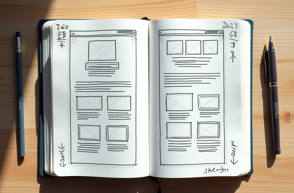
Clear Headline + Subheading (Above the Fold)
Start strong. Your main headline should say what you do and who you do it for — in plain English.
Example:
“Web design for growing businesses in Hampshire & Surrey.”
Follow it with a short subheading that explains the benefit of working with you.
Example:
“Fast, mobile-friendly websites built with WordPress — no jargon, no hassle.”
Then… give them a call to action.
“See recent projects”
“Get a free quote”
“Let’s have a quick chat”
Don’t make them scroll to figure out what you do.
-
Services or Solutions Overview
Right after the hero section, give a quick visual overview of what you offer.
Use 3–4 boxes or blurbs that link to your key services.
Example:
- WordPress Web Design
- Ongoing Website Maintenance
- Hosting & Support
- Custom Web Applications (ASP.NET)
This helps visitors self-identify and move deeper into your site.
-
Social Proof
This is one of the biggest trust builders — and most underused.
Add one or more of the following:
- Short testimonial with a name and company
- A Google review feed
- “Trusted by” logos
- A star rating badge or review count
You don’t need loads. Just something real and specific.

-
A Short About You Section
This isn’t your full story. It’s a quick intro that explains who you are, how long you’ve been doing this, and why people enjoy working with you.
Keep it human. Keep it short.
Example:
“I’m Neil, a freelance web developer with 30 years’ experience helping small businesses grow. I keep things simple, jargon-free, and focused on results.”
Then link to a full About page.
-
A Few Recent Projects or Clients
Show off a few examples of your work or the types of businesses you help. Include logos, short blurbs, or screenshots — and link to a full portfolio if you have one.
Don’t have a full case study? A few nice images with a line or two is more than enough.
-
Another Call to Action
By now, people are engaged. Remind them what to do next.
- Book a call
- Get a quote
- See more work
- Contact me
Make the button obvious and repeat it if your homepage is long.
What You Don’t Need on Your Homepage
- A massive photo of your office or van
- Endless paragraphs about your history
- Every product or service you’ve ever offered
- A slider with 6 rotating images (sliders rarely help conversions)
- A contact form in the hero section (save that for the contact page)
Clarity beats clutter — every time.
What You Can Do Next
Take 10 minutes to review your homepage.
- Does it say what you do — and who for?
- Can visitors tell what to do next?
- Is there a mix of trust, proof, and personality?
- Or does it feel like a dumping ground?
If you’re not sure, I offer quick homepage reviews — zero waffle, just useful ideas to tighten things up and help your site convert better.
Because your homepage doesn’t need to say everything. Just the right things.